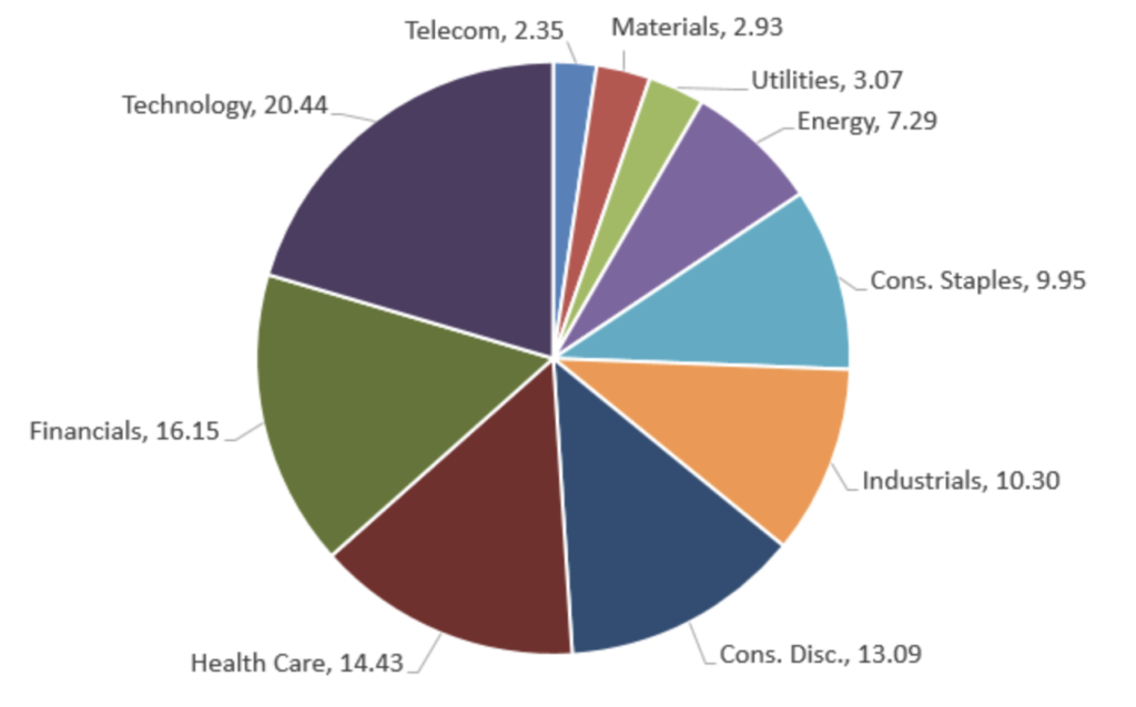
As investors, at one time or another you’ve seen the following chart depicting the sector composition of your sectors:
As I mentioned in my first post, this graph is terrible. I can guess that in a bewildered state, you are wondering “How can that be? I’ve seen that chart hundreds of times”. The problem is people have trouble reading pie charts. It is true that by presenting data in a pie, the reader intuitively understands that you are showing them the pieces that compose a portfolio; however, you’re going against the limitations of human perceptions. We are very good at comparing one dimension, but our facilities quickly diminishes when trying to compare 2 or more dimensions. That’s what you’re doing when generating a pie chart. You’re forcing the reader to compare multiple dimensions at once.
This limitation is very well known in the academic field of data visualization. If you have any doubts, take a look at the wonderfully complete discussion of pie chart limitations by the data visualization expert Stephen Few titled “Save the Pies for Dessert“.
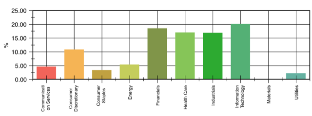
It’s fairly simple to avoid pie chart shortcomings by showing the sector composition in columnar bar chart. With the graph below, the user can visualize the composition by comparing a single dimension, height.
So I’ve now convinced you that bar charts are superior to pie charts, so we’re done. Nope! The chart above merely shows the composition as of a point in time. There is no historical perspective to give it context.
So what's wrong with graph depicting data as of a point in time?
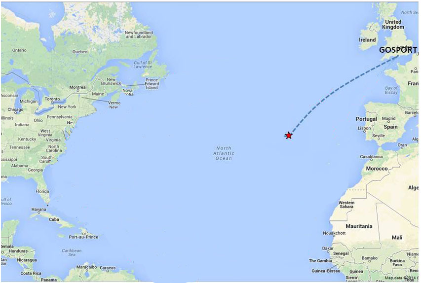
Here’s an analogy to give you a better feel about the limitations of “point in time” graphics. Take a look at the photo of the boat below.
Say you were asked to give an opinion on the appropriateness of the boat. Well, the man in the boat looks like he’s having fun and the boat looks like it’s in good condition. However, you might hesitate; since you don’t know where the boat came from or what is the destination? If it was to go 20 yards you’d have one answer, however if the route below was the intended voyage, you’d have a significantly different response
Image trying to analyze a company with only a balance sheet (no income statement, no cash flow). Yes, you could make some determination about the company’s prospects, but would you be comfortable investing?
Filling the data gap with history
Back to our sector bar chart. It too only presents a single moment in time; this is what your portfolio is right now. What’s missing is how you got there. Did the manager recently move into tech and out of health care? How does this compare with your portfolio as of last year? Is your manager adjusting your investments to changes in world events?
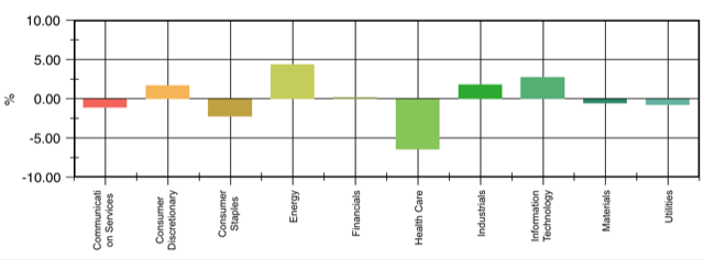
So to full this gap, we must add some historical prospective. In addition to the above chart, I recommend adding a 2nd graph to show changes to sectors over a period of time, as shown below:
The above graph depicts the changes to the sectors since the beginning of the year. Looking at this I can tell there was a significant decrease in the healthcare sector since January. Very useful information.
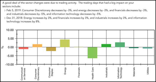
Let’s take this one step further. You, being the sophisticated reader, might say “Is that change associated with actual trades or did the healthcare position just decrease in their market price?” Great question. By adding additional investigation about the trade activity, I get the following more complete picture:
Terrific! With the combination of the two charts and the accompanying verbiage I finally get a complete understanding of my sector composition. I know what my current make-up is as well as the path that lead me here.
If you want to see this in action, download my app Investaware. You’ll get a complete view of your sectors along with a better understanding of your portfolio and how it’s being managed.