Most apps and websites handle account activity by creating a table displaying every transaction in the portfolio. “Let’s give the user all the details” is those designer’s typical montra.
Unfortunately rather than informing the reader, such volume of detail typically overloads the user. In other words, there is so much detailed data that the user gets overwhelmed by the minutia. Take a look at the example below of relatively light activity for one managed portfolio for one day.
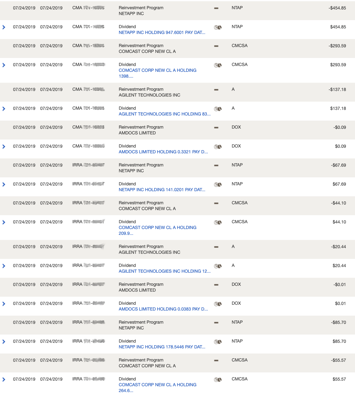
It’s almost impossible to view the table without going into a trance, let alone try to determine what happened to the portfolio on that day. Terms like “infobesity” and “infoxication” has been used to describe presentations such as these.
By presenting the transactions in this manner, there is no way one can make an informed decision when they are overwhelmed. What’s incredible about this particular deficiency, it can easily be resolved. By simply summarizing the data you allow the viewer to glimpse at aggregated information and quickly gain an understanding of the activity. For example, compare the summary below to the above table…
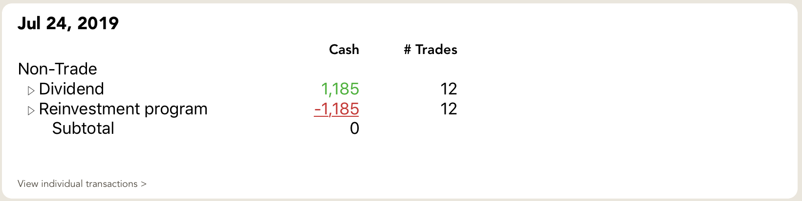
Rather than trying to mentally tally 24 lines, the summary gives the reader a good picture of the day’s activity.
Design considerations when developing trading summaries
Several principles should be considered when designing effective trade summaries:
- Separate discretionary from non-discretionary activity: Actions that a manager initiates are inherently different than actions that occur intrinsically as part of holding the position.
For example, users think of sales differently than dividends. Both result in cash proceeds to the portfolio, however, users tend to focus on tracking the manager’s pursuits; dividends are considered ingrained within the investment, that is something that occurs “naturally/organically”. - Summarize each type of activity: By given a separate line to each activity, the user can quickly get an overview. There is some disagreement as to whether the transactions should be broken down by asset class or not. Some believe that adding asset classes is too much detail and makes it more difficult to scan. Others feel it’s important, particularly for active portfolios with multiple assets classes. My view is that both approaches are reasonable.
- Provide both the cash effect and number of transactions: Both of these figures are crucial. The change in cash indicates the monetary effect of those transactions. The number of transactions conveys the number of positions affected.
- Also include access to the details: A summary is not a replacement for the trade details. It is a supplement. You should first present the summary and allow the user to then get to the transactions, if they want to investigate further. This schema follows one of the precepts of information architecture — to first present an overview and then show details. Users tend to view this structure as intuitive.
In addition to the above principles, you should also think about additional summary information that would give users further insight to the effect that the trading information had on the portfolio. Items such as adding new positions, closing existing positions, or significantly changing positions are all examples of good supplementary information.
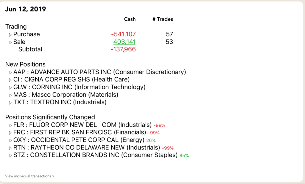
The example above not only shows new positions added, but also shows large changes that occurred to existing positions. Also note the sparse use of color. By maintaining a mostly monotone presentation, the punch of color (indicating increases/decreases) provides the reader with a sense of direction without detracting from the scannability. In his seminal book, Envisioning Information, Edward Tufte provided a great example of the effectiveness of using color sparingly on a monochrome field.
While this discussion of presenting trade activity summaries may seem intuitive, as of this writing, I don’t know of a single application/website that does this. They force users to absorb the lowest granularity inherent within the transactions details. By providing an overview you’ll give your users the affordance of understanding the day’s activity with a quick glance.
If you want to see this in action, download my app Investaware. You’ll get straight-forward activity summaries, with the detailed transactions just a press away.