Over the past 30+ years I’ve worked on many teams that developed technology, both commercial and in-house software, for the investment community. Although some incredible software was developed, typically tight time constraints forced most of these efforts to performing mere “tech updates”, that is applying new technology to build versions of older software or automating manual processes. Rarely did we have the luxury of taking a step back and exploring whether there these now familiar presentations were actually effective and whether they told the complete story to our users.

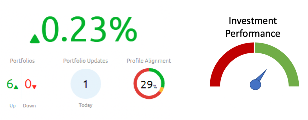
I was not alone. When talking to other FinTech professions, they spoke of coding new applications that created the same old pie chart, or line graph. Oh sure, with the latest library you could build really beautiful widgets (see below) and there’s nothing wrong with creating a beautiful interface, but I was left with nagging questions. Were we merely recreating the same wheel but with shiny new hubcaps? Even worse, was our wheel functional? In other words, were we replicating a car that had rounded rectangles for wheels rather than circles?
If I am right, then how has these ineffectual presentations perpetuated for so long? Well, for many of the firms I worked at, providing the standard package of graphs and charts was ok. They were large institutions that had a risk department which would supplement any information with their own analysis. So the nagging questions lingered. What about the people that don’t have their own private staff to guide them? How were they navigating the sea of information?
Pulling on this thread, in 2018 I started reviewing investment reporting from a variety of firms. I looked at the software provided by the investment banks / stock brokers to their retail customers. Yep, to my shock most had the same set of graphs and charts.
So, relying upon my decades of experience as both a system architect as well as a well-versed user of investment reporting, I’ve decided to take a fresh look at the traditional reporting suite and thus this blog was born. It’s purpose is to analyze a variety of familiar FinTech reports and to apply several cutting-edge disciplines, such as data visualization, natural language generation, as well as modern typography and user interface standards.
The purpose is to provide pragmatic improvements rather than esoteric discussions. To that end, I will be opinionated, since readers of this blog are looking for solutions to implement. For example, take a look at the sector chart below (which I’m sure you’re familiar with).
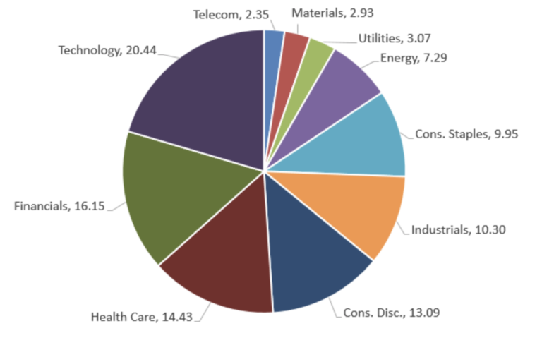
I’m here to say that the above chart is BAD. I’d go so far to say that the graph is so terrible in conveying portfolio composition that it should NEVER be used. I can picture the aghast faces reading my heresy. Don’t fret, a future post will explain what lead me to my conclusion and how to better report portfolio composition.
With all of the above in mind, this blog to delve into a variety of investment reporting, from graphs like the one above to even mundane subjects such as trade confirmations. Each post will take a specific aspect of investment reporting, analyze the traditional display and discuss practical changes that would make the presentation more effective.
As an aside, you can see all the solutions discussed live in action through my app, Investaware.