In financial technology, heat maps are fairly common graphical representations of market changes, either to a particular portfolio or the market as a whole. With one glance, users can get a good overview of how securities contribute to the overall performance.
Like many, I’m a fan of heat maps, however, to no surprise of this blog’s readers, I have issues with their implementation. In this post I’ll present a critical review of the heat maps from a major institution and how it could be improved.
Below is an example of the heat map within the Merrill Lynch tablet app.
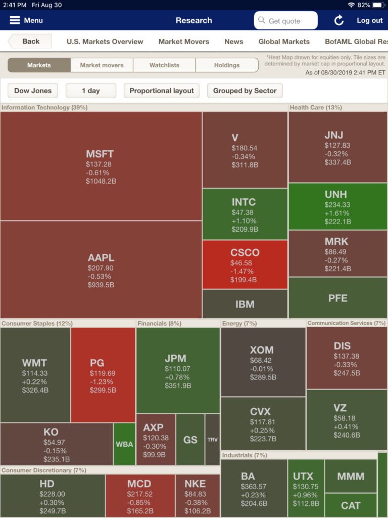
There’s a lot to like about the presentation. First off, it uses both color, space, and typography very effectively. Market capitalization is represented by the size of the rectangle. Color conveys both size and direction of the price changes. I do question the use of grey (see WMT and XOM), which seems to depict small changes both positive and negative. A little shade of green (positive) and red (negative) would have been more effective. Finally the typography (labels) let the reader identify the security without any additional action.
In other words, it successfully communicates a great deal of information.
However, life starts going awry when viewing Merrill’s heat map for a particular portfolio, as shown below…
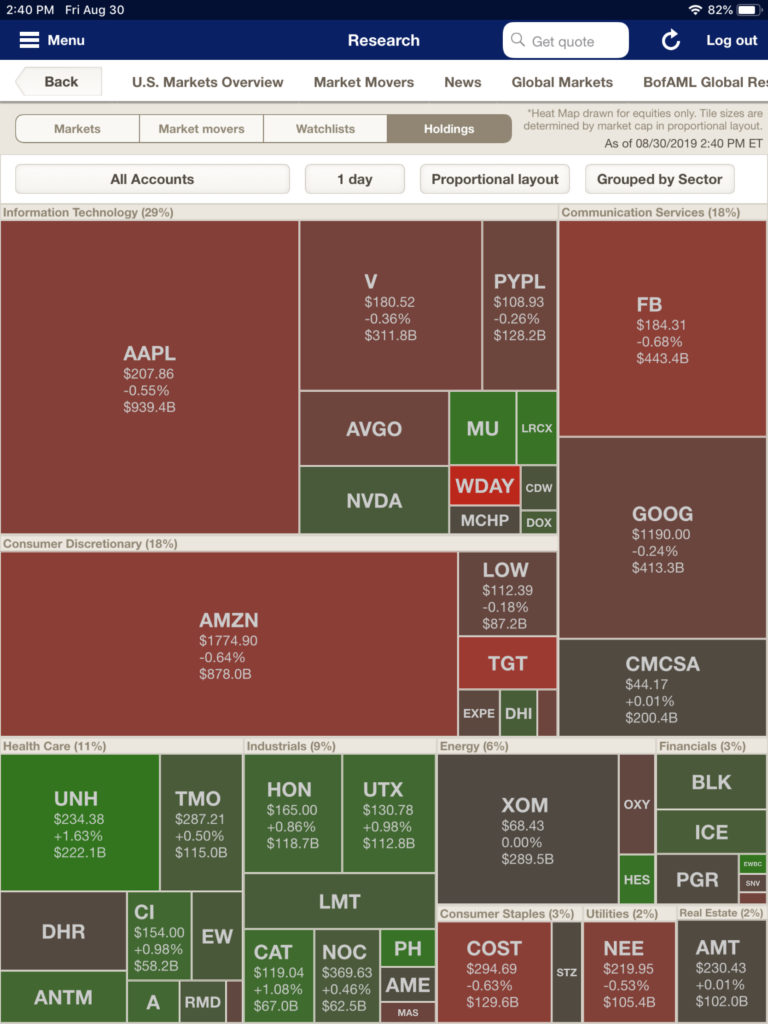
The developers considered the portfolio to be only a filter rather than a change of context. This results in the view only showing the securities in the portfolio (which is good); however, the position sizes do not reflect the size of the investment within the portfolio. It still shows the market capitalization of securities. This causes a disconnect with the reader. For example, the size of Amazon would be the same whether the portfolio had 1 share or 1,000. Just think how misleading this graphic would be if 99% of the portfolio was in United Healthcare (ticker:UNH). The user would see all the red and think their portfolio decreased in value, however, the opposite would be true.
Another shortcoming with the portfolio heat map is that it doesn’t show the positions that have no market price. Without those non-market positions (such as cash), users can’t get an accurate visual image of the entire portfolio. From a programmings aspect just showing market positions also creates technical problems of trying to depict percentage of the portfolio. Take a look at the alternative heat map below.
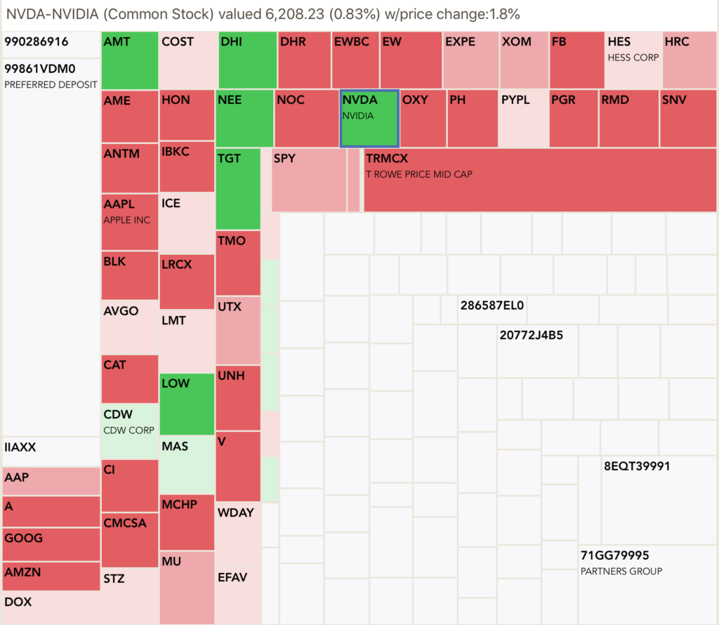
By showing all the positions (whether priced or not) as well as sizing of each position based upon their percentage of the total portfolio, the reader can easily gauge the market impact on their portfolio.
Of course there are trade-offs. By showing the entire portfolio you run into the issue of not having enough screen space to label the smaller positions — and no 3 point font is not an option. This implementation overcomes the problem by allowing users to select a position and have the description show at the top of heat map. In the above example, a user selected the box labeled “NVDA”. In addition to the name of the position, its size and market change are also included. Another solution to the small position problem would be to allow the user to expand the size of the heat map, however if the size goes beyond the screen, then portions of portfolio will be hidden and will force the reader to scroll.
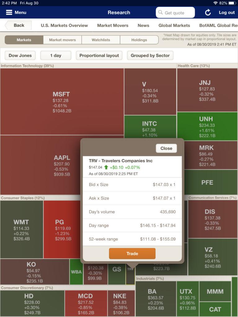
Merrill’s implementation also gives the affordance of additional information (as shown below). Instead of sacrificing screen space, Merrill’s team chose a pop-up window; it saves space but does require users to close the window to continue.
As you can see with these examples, heat maps are a great way to show users a visual of market impacts; however, care must be taken to avoid confusion. Always keep context of the map in mind and reflect that context in the graphic–don’t show market percentage (aka:capitalization) when the user requests a map for their portfolio.
I’ve beaten up Merrill Lynch in this post, but it’s worth mentioning that Merrill does several innovative and effective presentations for its clients. Of particular note is the terrific way they use stories to present investment information, but that’s for another time.
In summary, a heat map is a great alternative to the tradition grid showing holdings. If you want to see portfolio heat maps in action, download my app Investaware. You’ll see heat maps as supplementing sortable grids.