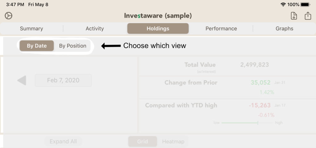
This page displays investment positions. You can view the positions from 2 perspectives, either all the positions for a given date or the history to date of on particular investment. The controls at the top of the screen allows you to select which view.
By Date
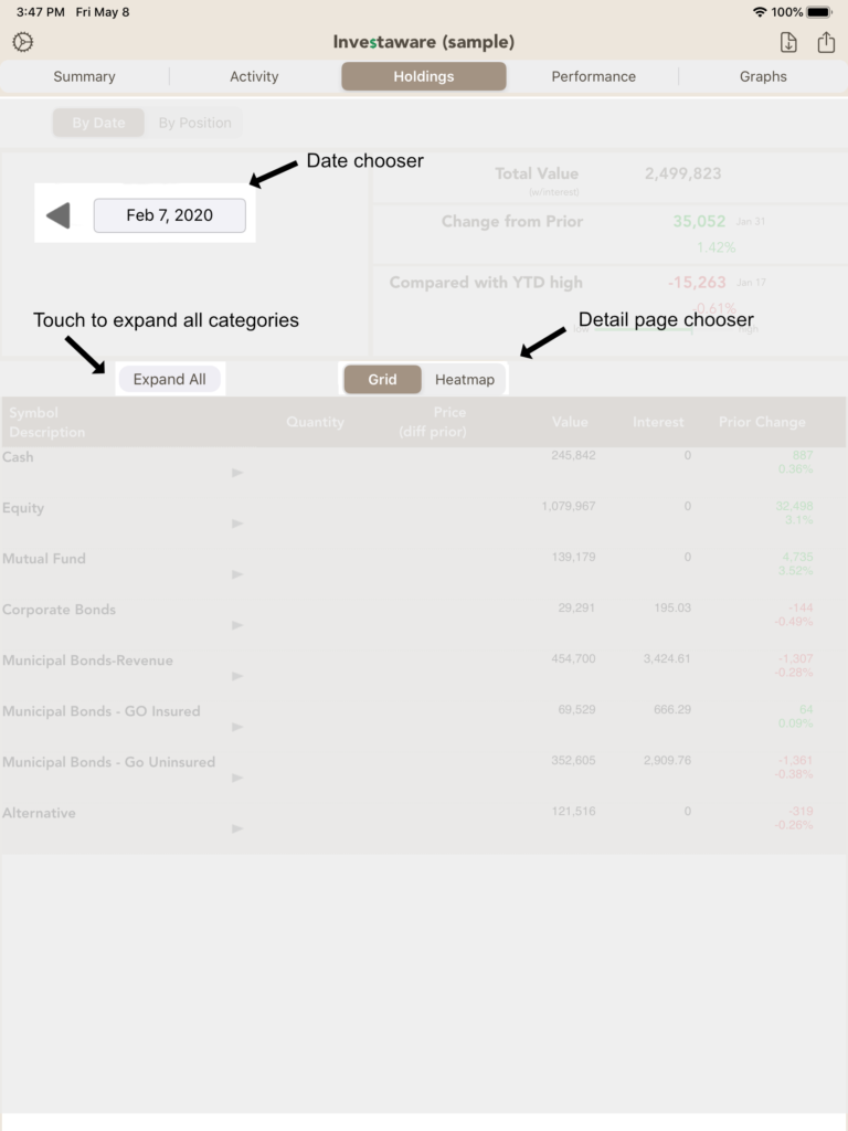
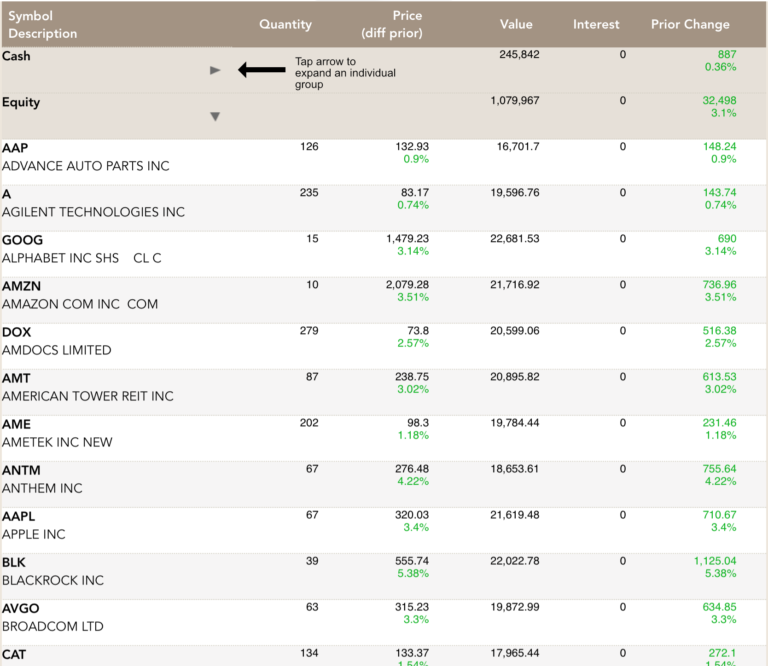
When you choose the “By Date” view, then you also have the options of choosing a particular date and whether to show those positions in a grid or in a heat map. When you select the “Grid”, the positions will be categorized into their investment types. You can tap the button to expand all the categories. You can also expand a particular category.
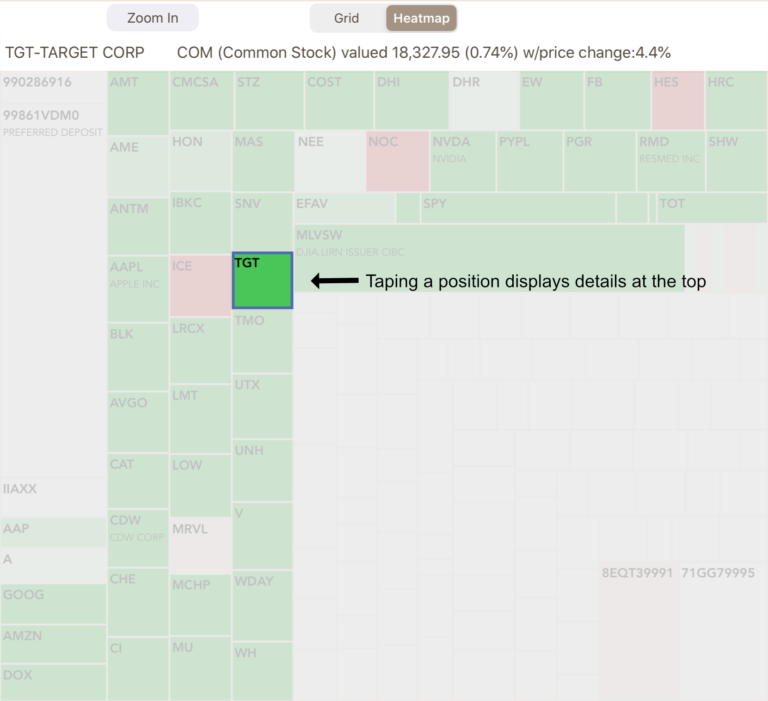
You also have the option of seeing all your positions within a heat map, which shows a rectangle for each position. The size of each rectangle reflects the percentage of that position within your portfolio. Each rectangle is color-coded to indicate whether the position has increased (green) or decreased (red). Lighter colors are used for smaller changes while darker colors are for larger changes.
If you tap on a position, then the details are shown at the top of the map; if you then tap on those details, Investaware will take you to the holdings by position, showing all the information about that investment.
The heat map defaults to fit all your positions within the screen, but if you have a lot of investments, then the boxes can be too small to view. In those cases, tap the “Zoom In” button to enlarge the map. When “zoomed” you can scroll the map to see positions not visible.
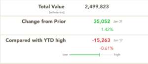
No matter which detail view you choose, you’ll still get a summary at the top of the page for all the positions for the selected date. It will display the total value for all the investments, the change in value from the prior imported date and the comparison of that day to the year-to-date high point.
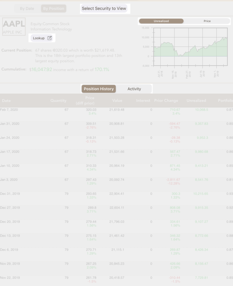
By Position
An alternative to viewing all the positions for a given day is to show all the history of a given investment.
On the “by position” view, you can select an investment and Investaware will display the complete history of the security. The view contains a number of options including:
choosing between a graph of the investment’s unrealized or the investment’s price (which is based off the price when the security was initially purchased).
display position history of the security or the activity of the investment.
In addition there is a button to do a web lookup of the security, which will present a website describing details of the security (such as company overview).